
UI/UX • PRODUCT DESIGN • FIGMA • CASE STUDY
Edvisors Design Exploration
Designing financial products for students and parents is a balancing act between clarity and complexity. The financial aid landscape is filled with complex jargon, multi-tiered calculations, and high emotional stakes. During my time at Edvisors, I explored various user interface patterns, component variants, and interactive flows to simplify student loans, calculators, and onboarding portals.
Below is an exploration of the design methodologies, wireframes, and live implementations created to lower friction, build trust, and optimize conversions.
1. Cost of Attendance & Gap Calculator
A major friction point for students is understanding the “gap”—the difference between what a college costs and what financial aid covers. To address this, I worked on modularizing the Cost of Attendance and Student Aid Offers interfaces.
In the design system, I structured separate desktop and mobile variants to account for complex multi-column grids:
The design system layout grid showing vertical stacks for cost inputs, grant offers, and savings calculations.
The live implementation translates this structure into progress-focused components, allowing users to switch between state residency and housing variables dynamically:
 Live Cost of Attendance calculator interface
 School search and logging UI state
2. Before & After Refinance Summaries
Refinancing a student loan is a major decision. Users need to immediately see the bottom-line benefit (e.g., lower monthly payments or reduced lifetime interest).
I explored multiple ways to present these complex before-and-after calculations, comparing side-by-side tables, text-focused comparison lines, and visual progress bars:
Iterative design variations for presenting comparative financial summaries.
The finalized visual summary card simplifies these data points into a clear, high-contrast block highlighting the monthly payment and total interest difference:
Final high-fidelity mockup showing input controls on the left and the interactive refinance outlook card on the right.
3. Sliders & Micro-Interactions
Dynamic inputs like sliders reduce typing fatigue and allow users to explore different financial outcomes instantly. I developed different slider styles to represent currency values, interest percentages, and loan durations:
Exploring label alignment, handle size, and input box layouts for key range controls.
4. Lender Card Layouts: Drop-in, Context-Aware Placement
Edvisors connects students with private loan offers. Because featured lender placements are critical to business operations, these components need to be placed dynamically in various contexts across the site—whether inside a narrow sidebar, a wide homepage section, an editorial callout, or a footer banner.
To achieve this, I built these cards as completely context-aware components. The main objective was absolute placement freedom: allowing our CMS, editorial, or backend teams to drop a lender card literally anywhere without having to worry about layout breakage, custom sizing flags, or passing complex configuration parameters. The card measures the space it occupies and adapts itself (re-aligning from a vertical stack with a top banner to a horizontal row with a side banner) automatically. By decoupling layout decisions from code flags and letting the component adapt natively to its container, we created a truly plug-and-play asset that speeds up editorial publishing and placement testing.
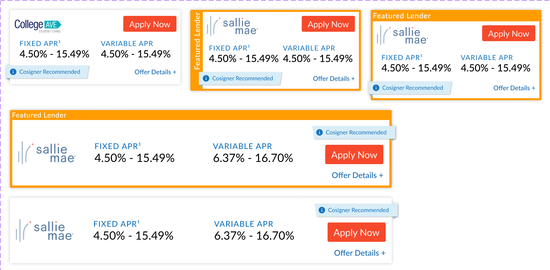
Comparing compact column layouts against wide rows to test how context-aware presets adapt to parent widths.
5. Secure Onboarding: Two-Factor Authentication
Security interfaces are notorious for user drop-off. By wireframing a clear, step-by-step two-factor authentication portal, we kept users informed through each phase of registration (selecting verification method, scanning QR codes, saving backup keys, and entering verification codes):
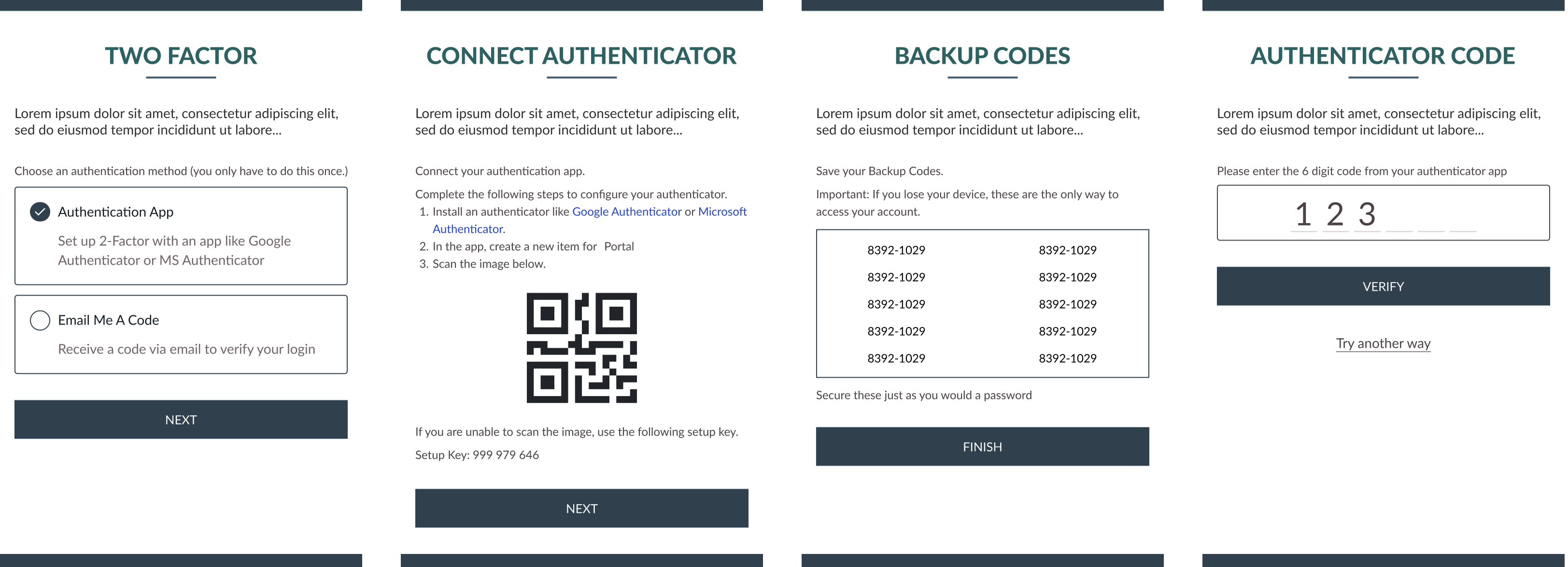
Onboarding wireframe highlighting a logical, 4-step security configuration workflow.
6. Live Navigation & Resource Directories
A key part of the Edvisors experience is guiding users to resources and articles about college planning. I designed clean category navigation hubs, custom FAQ accordion blocks, and illustrated resource listings:
 Category Hub for student resources
 FAQ accordion interface in action
 Illustrated article list view
By iterating on components and mapping out detailed visual states, we created an accessible, trustworthy portal that empowers students and families to navigate the complexities of financial aid.